
AdrianWarren.com: Reviews: Canon EOS 400D
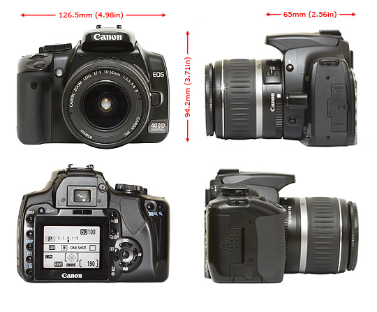
Comparing the front of the EOS 400D with its predecessor reveals relatively minor differences; the grip is fractionally deeper on the 400D, the area where the right hand thumb rests has a more tactile finish, and the shutter release button is now black instead of silver. Despite these apparently minor changes, they do add up to give a noticeable improvement to handling; the camera feels slightly more solid compared to the 350D too.
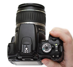
The most significant changes have occurred at the back of the camera. The majority of the button layout will feel instantly familiar to anyone who's used the previous models in the line, but there's a big surprise; the screen. In addition to being much larger, it's also brighter and gives a far better feel for what the camera has captured; more significantly the secondary status display has been removed.
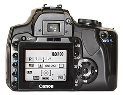
Whilst the two display sizes only look slightly different here, when you use the Canon EOS 400D and the 350D side-by-side you realise what a significant improvement it is compared to the outgoing model. Colours and brightness feel more accurate, and the viewing angle is improved too.
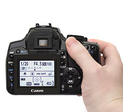
The 400D feels slightly better built than the outgoing model, and there have been a number of minor tweaks to the handling; nothing major though. I find the 400D fits my hand well, but some users feel it's too small for their comfort.
