AdrianWarren.com: Tutorials: HDR
Processing HDR images.
Previous: Creating an HDR image
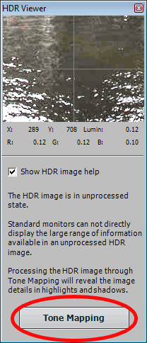
Assuming you created your HDR file in the previous step (click here if you haven't yet), you should now see a palette entitled "HDR Viewer" and a window with a very strange silhouetted version of the original image on it. This is the unprocessed HDR image, which in parts is both too dark and too bright for your monitor to display.
TIP: Some lenses, usually wide angle ones, suffer from an issue known as chromatic aberration (CA). CA causes coloured fringes to appear towards the edges of the frame, particularly in areas of high contrast. These coloured fringes are magnified by the ToneMapping process, as it boosts local contrast. The solution is to remove the CA from the source images before you merge the images to HDR. Some RAW conversion software can do this for example DxO, Canon Digital Photo Professional (DPP) v3+ and Adobe CameraRAW. If you only have JPEG images don't worry, you can still fix it, as Photoshop CS2+ has an option called Filter/Distort/LensCorrection.
If you move your mouse pointer over the image itself, the thumbnail image shown in the HDR Viewer window will show you the detail in that area, adjusted to display on a normal monitor.
When you've finished having a quick look at your first HDR image, click the Tone Mapping button to see the options for transforming your HDR image into something that everyone can enjoy.
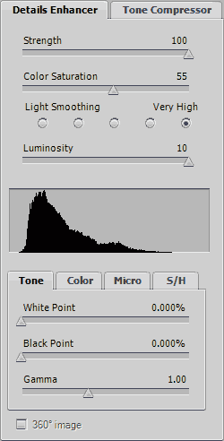
Now you should see the Details Enhancer window. Don't worry if it looks a bit daunting at first, I'll explain everything soon enough.
You might be familiar with some of the more unnatural HDR images, they're almost all created in Details Enhancer mode; that said you can create relatively natural looking images with it too, but generally the most realistic looking images are created with Tone Compressor. I recommend you experiment with both modes, and all the settings to familiarize yourself with the ToneMapping process.

Details Enhancer
Strength: The first thing I suggest you do is move the Strength slider to 100%. The Strength slider determines how much of the tone mapping effect is applied to the HDR image, with it set to 100% it's far easier to see the effects of experimenting with the other sliders. When you're happy with the effects on your image from the other sliders, I suggest you try reducing the Strength just to see whether the image looks better with a slightly lower value.
Saturation: The Saturation slider does exactly what you'd expect, it adjusts the intensities of the colour in the image. 0% is black and white, and 100% is usually eye watering; for a natural result I suggest you try a value somewhere between 50% and 60%, I usually use 55%, but do bear in mind that I like stronger colours. There's currently an issue in Photomatix (v3.0.1/3.0.2) which means this doesn't quite work as expected at low ToneMapping values.
Light Smoothing: Adjusting the Light Smoothing setting adjusts the overall smoothing of contrast. Low values of Light Smoothing (i.e. those to the left) in most cases will cause haloes around high contrast edges. As I prefer some realism I tend to set this to the maximum value, Very High. This is a setting I recommend you experiment with though.
Luminosity: A positive setting on the Luminosity slider brightens the shadow areas and increases local contrast, a negative setting darkens the shadow areas whilst reducing local contrast. Use in conjunction with the Gamma adjustment to alter local contrast without changing the brightness, for the same overall brightness you need to increase Luminosity and decrease Gamma by similar amounts or vice versa. For this image try a setting of +10, to give the highest amount of local contrast.
Tone tab: The tone tab has three options, White Point, Black Point and Gamma.
White Point increases the brightness of the image. For the sample image I suggest you set it to 0%. With non-zero values you run the risk of clipping the highlights, which is exactly what we were trying to avoid in the first place. Watch the right hand end of the histogram carefully if you do decide to increase it.
Black Point decreases the brightness of the image. For the sample image I suggest you set it to 0%. With non-zero values you run the risk of clipping the shadows. Watch the low end of the histogram carefully if you do decide to decrease it. If you increase both Black Point and White Point, you can increase the overall contrast of the image, but it's generally better to do that later in Photoshop using Curves.
Gamma adjusts the brightness of the midtones of the image. For the sample I recommend a value of 1.00. Perhaps counterintuitively, moving the slider to the left of 1.00 will increase the higher number value, whilst moving it to the right will result in a lower value.
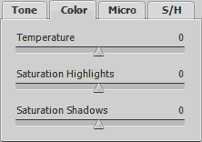
Color tab: The Color tab has three options, Temperature, Saturation Highlights, and Saturation Shadows.
Temperature adjusts the colour temperature of the image. Negative values make the image more blue, positive values make the image more orange. This may not seem immediately useful, but it is. If you take an image on a cloudy day, or in the shadows the colour balance generally takes on a bluish hue. Conversely if you shoot in sun during the early morning, or late afternoon your shot will take on a more orange hue. In most cases a value of zero is preferred.
Saturation Highlights does exactly what you'd expect, it adjusts the strength of colours in the brighter parts of the image. Again, for the sample I suggest you leave it at zero.
Saturation Shadows again does exactly what you'd expect, it adjusts the strength of colours in the darker parts of the image. For the sample I suggest you leave this at zero too.
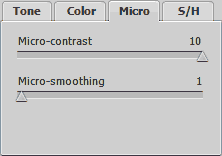
Micro tab: The Micro tab has two options, Micro-contrast and Micro-smoothing.
Micro-contrast does what you'd expect, it adjusts the local contrast of the image; higher values make details more prominent, whilst lower values make details less prominent. I suggest you set this at 10 (the maximum value) for this sample.
Micro-smoothing levels out differences in local contrast. In general I leave this set to 1. A value of zero would give the strongest tone mapping effect, but I find it tends to bring out any noise in the image too strongly. Ideally you need to view the image at 100% zoom whilst adjusting this on your own images, to do that you just need to click on part of the image. I recommend you look at the areas of your image where moving the slider seems to have the strongest effect.
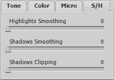
S/H tab: The S/H tab has three options, Highlights Smoothing, Shadows Smoothing, and Shadows Clipping.
Highlights Smoothing: Non-zero values of Highlights Smooting will reduce the effects of tone mapping in the brighter parts of the image. I suggest a value of zero for the sample set.
Shadows Smoothing: Non-zero values of Shadows Smooting will reduce the effects of tone mapping in the darker parts of the image. Again a value of zero works well for the sample.
Shadows Clipping: Non-zero values of Shadows Clipping will make the darker tones in the image flatten to black, the higher the value the more of the darker tones you'll render black. I suggest a value of zero for this one too.
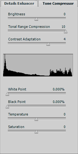
Tone Compressor
Brightness does exactly as you'd expect; positive values make the image brighter, negative values make the image darker. I tend to leave this set to zero.
Tonal Range Compression, higher values make both the shadows brighter and the highlights darker, which means you can see detail in shadow and highlight areas more easily. Negative values make the highlights brighter and the shadows darker, which usually results in an almost silhouetted image. I suggest setting this to maximum (+10) for the sample image.
Contrast Adaptation has a similar effect to Tone Mapping in Details Enhancer mode. Positive values boost local contrast, negative values decrease it. I suggest a value of around +4 for the sample image.
White Point increases the brightness of the image. For the sample image I suggest you set it to 0%. With non-zero values you run the risk of clipping the highlights, which is exactly what we were trying to avoid in the first place. Watch the right hand end of the histogram carefully if you do decide to increase it.
Black Point decreases the brightness of the image. For the sample image I suggest you set it to 0%. With non-zero values you run the risk of clipping the shadows. Watch the low end of the histogram carefully if you do decide to decrease it. If you increase both Black Point and White Point, you can increase the overall contrast of the image, but it's generally better to do that later in Photoshop using Curves.
Temperature adjusts the colour temperature of the image. Negative values make the image more blue, positive values make the image more orange. This may not seem immediately useful, but it is. If you take an image on a cloudy day, or in the shadows the colour balance generally takes on a bluish hue. Conversely if you shoot in sun during the early morning, or late afternoon your shot will take on a more orange hue. In most cases a value of zero is preferred.
Saturation does exactly what you'd expect, it adjusts the intensities of the colour in the image. -10 is black and white, and +10 is usually eye watering; for a natural result I suggest you leave it on zero.
Saving
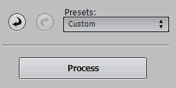
As there are so many different settings to experiment with, it's a good idea to save your settings when you're happy with them. To save them, click on the box underneath Presets: where it says Custom. Now click on "Save Settings..
.", type a filename in the Save As window. I recommend you use a name that describes both the scene and which mode you used to create it. Then click on the Save button.
That will save the settings, but remember it doesn't save the image itself!
To save the Tone Mapped image itself, you'll need to click on the Process button. When Photomatix has finished processing it, go to the File menu and click Save As. Again I suggest you choose a descriptive name, so that you can find it more easily when you come to use it again.
